Saturday, April 10, 2010

My favs


Hello All,
Wow, it's been a while.
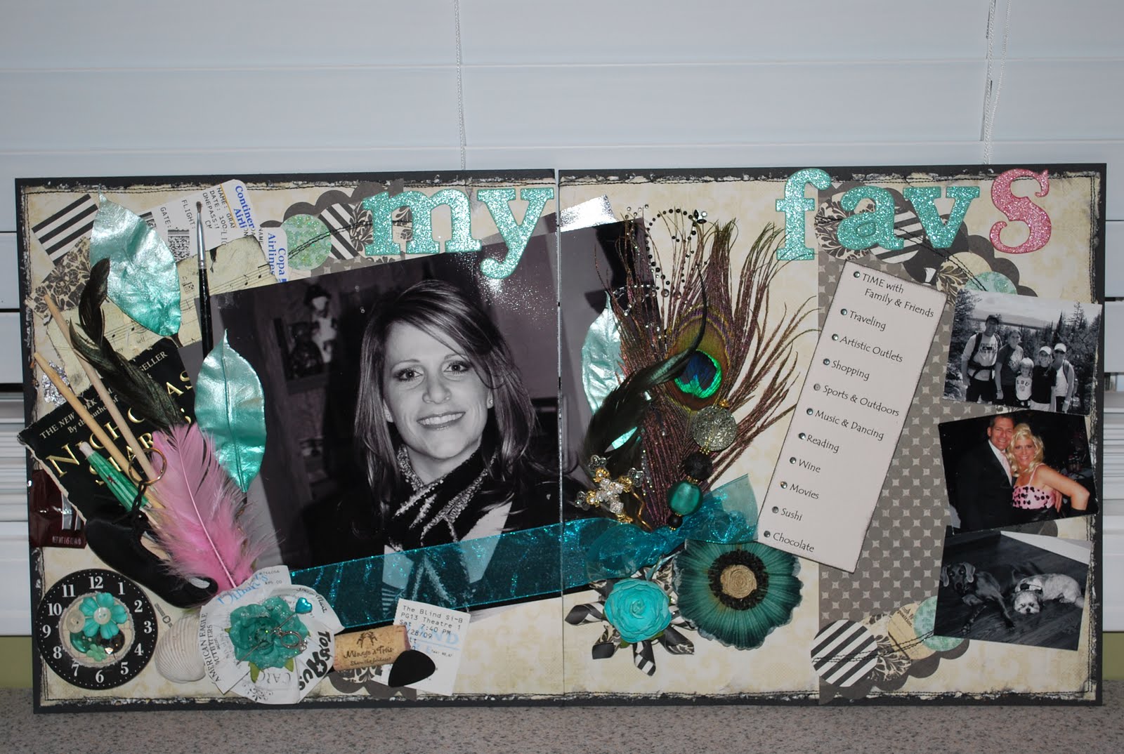
Here is my layout from our first assignment on the Design Team.

As you know, we had to do a layout about ourselves, and well, this is a struggle for me cause, seriously, I don't scrapbook about just myself. It's usually my kids, vacations, holidays, or events.

The paper line i used was My Minds Eye--Spider's Web and the doily is from Crate Paper. The second (light colored) paper on the background was distressed, inked and then sewn to the black paper. I cut the doily in half and then punched different shaped circles and placed them around the edges of the doily and sewed them on.

The idea i had for this layout was to make a list of some of my favorite things and then to put something on the layout that corresponds with each one. Most of the items are clustered on the left side of the picture. And yes, I love to cluster!!

So bear with me as i go down the list:
1. time w family and friends--to represent this i took a heidi swapp chipboard clock and cut out the center and then pop-dotted a different background and put flowers, buttons, and bling in the center
2 .Traveling (love traveling). I put some of our actual airline tickets and a seashell from the beach in Brazil.
3. artistic outlets--for this i put one of my paintbrushes and well, the layout is a representation of this too.
4. shopping--the flower at the bottom left is made out of different receipts i found in my purse at the time. i topped it with a prima flower and put a ring on a pin thru the flower. hehe
5. sports n outdoors (tough one)--the feathers and the picture on the top right of us hiking in Yellowstone. (I know, i'm reaching on this one.)
6. music n dancing--i took a piece of sheet music and tore it and distressed it and placed it on top of the airline tickets. down at the bottom is one of my husbands guitar picks, and the jazz shoe is from my daughters dance bag.
7. reading--took the cover from the book of one of my favorite authors--nicholas sparks
8. wine--got a cork from a bottle of wine (prolly the one i was sippin on whiloe doin this layout)
9. movies--there is a movie stub down at the bottom next to the wine cork
10. sushi--chopsticks are clustered in there with the other stuff
11. chocolate---got a dove milk chocolate and hershey bar wrapper in there as well.

I had to put a cross in there as well, because, where would i be without God in my life.

The pink represents my mardi gras krewe---Xanadu (pink is our signature color). The middle picture on the right (the only one in color) is a picture of me and my husband at the Ball this year. I was dressed in pink and a blonde wig because i was an entertainer and danced at the ball. we were supposed to be Barbies. lol. I balanced out the pink on the other side with a feather from the table decorations.

Well, i think that's it. Hope u like it.

Tuesday, December 1, 2009

ZTA


This was our final design team assignment----tear, tear. I enjoyed doing this layout since Melissa pretty much gave us free run with it. All we had to do was use one of the sketches that she gave us and the Webster's threads, silhouettes, and fabric fancies. I personally liked using the sketches----less thinking.
Anyways, this is a layout of my oldest, Chelsea, and her Zeta sorority (?) family. This is the night when her 'little sis' found out who her 'big sis' (Chelsea) was. I hardly get to scrapbook about Chelsea anymore since she went off to college. I really miss it. She doesn't take pictures of everything like I do----I was lucky to get these 2. The big one is her and her lil sis and the other is her entire sorority family. I really liked doing this layout and think it is one of my favorites.
Well, the year is over and I want to say thank you to Melissa and all the other ladies on the D.T. team. I really enjoyed the year and learned alot from the ladies-----y'all were fabulous and I'm grateful that I was blessed to be in the same company as y'all. You are all awesome scrapbookers. Melissa, thanks for constantly shoving me outside of my comfortable and cozy box and pushing me in the totally opposite direction of where I wanted to go. I'll miss it all!


Wednesday, November 4, 2009

Nature...the great escape.


This is my layout for the Design Team September Assignment. The products I was given were the Prima Iron Ons (bright pink flowers), Canvas, Tim Holtz Destress Stickles (Scattered Straw), Prima Pebble, Graphic 45 Paper, Prima felt stems, 7 Gypsies book cover, and a straw looking piece of ribbon.
The challenges I met were:
1. Combine water with Tim Holtz inks or paints. I used this technique to create my butterflies. First, I used my Stampendous Butterflies Stamps and Staz On ink to stamp the butterflies onto just some plain white paper. Then I cut them out. Next, I took 3-4 different Tim Holtz inks and stamped randomly onto a piece of craft paper and then misted it lightly with water with my Mini Mister. Then I just rubbed the butterflies into the ink. Next I added some wire for the antenaes.
2. Use a doodling template to create a background or enhance a print. I used the Bazzill flourish doodling template to accent my background paper with red flourishes.
3. Use the canvas 3 different ways. My first way was the the 12x12 label print behind the large photo. I used the Claudine Hellmuth Studio paints to paint the canvas and then cut it out. I tried to use the same colors and mirror the reflection in the picture. Second way is the canvas flower. I cut 3 different size cirlcles, glimmer misted them and then attached them with a brad. Lastly, the title on my book cover is canvas. I cut it in a square, leaving the ends tattered and then painted it blue. I then stamped the title and flowers onto a piece of tissue paper, painted it with water colors, and then adhered it to the canvas using multi-medium gloss. Oh, and one more place I used canvas was on the inside of the book above the picture on the right side. I just cut a strip with pinking shears and then cinched the strip with red thread.
4. Use buttons and/or create buttons. I created a flower out of buttons and also used several different buttons as accents on the inside of the book.
5. Use one color photo among black & white pics. My big one is color and all the rest are b & w.
6. Use lace or fabric. I used both. The orange flower above the button flower is fabric. I glued some fabric down to a piece of chipboard then stamped a flower and cut it out. I used lace on the edges of my book.
Well, that's it. Hope you like.

It's All New


I'm a little late but I finally finished Luke's 1st day of school layout. This year was a big transition for him. We moved him from public school to private school. He has handled the change great....we are so proud of him. That's why I titled it this way....because basically everything was new to him. I really like the picture of him walking up the sidewalk to his new school and the one of him shaking Father Tom's hand. He is adjusting well. We just got our first report card and he has all A's and his teacher talked to me today about having him tested for Gifted. Woo Hoo!

80's Flashback


At our Design Team meeting for September I was paired up with Kaylin to create a layout. The line of paper we were given was the Cosmo Cricket Boyfriend line. I want to say upfront that I did NOT like this paper. I would NEVER buy or use it.....I guess that's why it's called a challenge. But in the end I did like what we came up with. Some old pictures from back in the 'big hair' days would be totally bitchin on this layout....totally....for sure! Can u believe we actually used to talk like that? My favorite thing on it is the stitching. Thanks for putting up with me Kaylinn! Lol

Tuesday, October 13, 2009

Pretty Maids All In A Row


This was my layout from our latest Design Team assignment.
I was given 2 sheets of purple Coordinations paper and a bottle of purple Smooch. I have to say I enjoyed this months challenge. I had never used Smooch before but have to say I really like it.
The Challenges I met were:
1. Use punched out circles in your design. My cirlcles are out of different patterned fabrics. I cut them out and then sewed around the edge with a zig zag stitch. There are 3 in the cluster at the bottom of the large photo, one on the left side of the photo, and one at the top.
2. Use Smooch 3 different ways. I stamped flourishes onto the lavendar Coordinations paper (making it a print) using several different shades of Smooch. I painted designs on the white buttons with Smooch. The petals on the small prima flowers are accented with Smooch. The Charm that says Together Forever (next to the heart) and the floral charm in the cluster at the top next to the canvas tag is colored with Smooch. The flower on the canvas tag was painted with Smooch. It was originally orange and yellow and green. The fleur-de-lis is stamped and outlined with Smooch. The word ALL is painted with 2 shades of purple Smooch (the letters were originally copper). Lastly, the arrow and center of the flower at the top left--on the folded over paper--is painted with Smooch. I guess I went Smooch crazy! Tip---the Smooch takes a long time to dry so I helped the process along by using my embossing heat tool.
3. Use the Coordinations paper 3 different ways. The large photo is backed in Coordinations paper that I distressed and inked. I like the way the paper changes color when you do this. The word MAIDS was cut out on the Cricut in purple using the Jasmine font then shadowed with the black paper and then sanded on just the lower portion. The word was also pop dotted to give it some definition. Lastly I antiqued the lavendar Coordinations paper by crinkling it up and then sanding lightly over it so that just the creases changed color. Cool paper!
4. Create square of rolled edged paper within rolled edged paper. First I tore out a large square from the lavendar paper, distressing and curling the edges. Then I put a smaller square of different printed paper that had been distressed and curled also inside the larger square. I sewed the square down and also sewed aroung the outer edges of the large square.
5. Use 4 prints. By changing my lavendar paper into a print with the stamping, I used 4 prints.
A few other goodies not mentioned above. The heart was made by taking a chipboard heart, putting glossy accent all over it and then pouring a mixture of seed beads that I had mixed up in a small cup all over it. The tip of the 2 pins were originally pearl but I changed the color of them to purple by pouring purple alcohol ink on them. The frame around the small picture on the upper right side of the large photo was originally canvas. I changed it by painting it and then stamped it with a word stamp from Glitz. Whew!

Monday, September 14, 2009

adventure in the great outdoors


i think this is the final layout for san francisco---woo hoo! This is us hiking in the redwood forest. The trees were HUGE! The biggest I've ever seen in my life. The paper is My Minds Eye that I picked up at Scrapfest. The bottom vine was made using a stencil, tacky glue, and brown glitter and green turf grass. The top is an assortment of ribbons, vines, leaves, etc... yes, i will journal---soon.

Wednesday, August 19, 2009

Oh so lucky to be loved by you


And oh so lucky to be finished with my San Francisco/Napa scrapbook. WOOO-HOOO! It only took me two years. Anyways, this layout is of Paul and I in Sausalito. This was the beginning of our trip. We had just landed and gotten our rental car (a mustang convertible) and was driving out to the valley. Just after crossing the Golden Gate Bridge we came into the little town of Sausilito. It looked so charming we just had to stop and check it out. We ended up having lunch at a place right on the bay overlooking the water. Wouldn't it be nice to live there?

LHS Dance Team Banquet


My middle daughter, Alyssa, lives and breathes dance! Therefore, most of the layouts I do of her usually involve dance in some way, shape, or form. Sometimes it gets difficult to come up with yet ANOTHER dance layout. LOL

LHS Dance Camp 09


LHS dance team dance camp was held back in June at UL. This is when the teams find out if they qualify to compete at Nationals. These are pix I took of their home team performance. The layout was pretty quick and easy. The design at the top was made using the Tattered Angels glimmer screens with the Black Gold glimmer mist. Then I just arranged my pictures, placed a black lace ribbon and 2 clusters of 'stuff' (bling, flowers, chipboard) Oh, and they qualified to go to Nationals. Yaahhh!

Wednesday, August 12, 2009

Wine Tasting


Hey everybody,
hope all is having a great summer. I can't believe how fast it flew by and that the kids are already in school again. Sorry I haven't posted much this summer, but this is usually a chaotic time for me. We just got back from our "back to nature" vacation that my husband decided we would go on-----13 days, 3 national parks, 4,045 miles total round trip. It will be a loooong time before I sleep in a tent in 37 degree weather while listening to the wolves howl again. And I'm not even going to get in to the whole community shower/bathroom thing. One good thing is I took lots of pictures (around 500) so I have lots to srapbook. The countryside was really breathtaking. Buuut....I made a deal with myself that I wouldn't start on this until I finished up my other 3 vacations (Disney, San Francisco, New York). I have been trying to finish these for about 2 years now. I'm excited though 'cause I'm almost finished! Yaaay! I've also been helping my sister-in-law this summer with her daughter's graduation album. But, she's a teacher and being that school just started, I think that party's over. LOL.
Anyways, this is a layout of me and my husband in Napa Valley. We spent the day going to the different wineries and doing the tastings. I used the K & Company Que Sera Sera paper, tags, letters, note cards, frames, die-cuts and embellishments. I loved that line---so colorful and fun. I loved how they had all the "stuff" to go with the paper. After placing the pictures I put several clusters of "stuff" and that was it.

Wednesday, July 8, 2009

D6 layouts


Connie's Designer Eye 6 was her best yet---in my opinion. Hat's off to you!!!! I absolutely loved this class and have already done 6 of the layouts. I love seeing the differences in everybody's layouts just by changing the papers and pictures and and the addition of personal flare. Here is my 6 layouts that I did from the class.

Wicked


This is a layout I did centered around the broadway musical WICKED that my girls and I went to while in New York. It's a simple layout but I loved doing it. The left side is a freehand drawing that I did using the actual brochure (on the right) that we received at the musical as my guide. I had to draw each section on the 4 different pieces of paper and then layer them on top of each other. The lips and eyes are painted on. I only used one picture----me and my girls outside the gershwin theater---and I used the actual tickets, that way I didn't have to journal.

Monday, June 8, 2009

Trick or Treat 08


This is a layout I did of my son and his friends at Halloween. My girls feel like they are too old for Halloween, but I say, "are you ever too old for Halloween"? I know I still dress up for Halloween, anyways......

This layout was extremely easy and fast to do. I used 4 different coordinating papers, ribbon and rub-ons. The skeleton face is a cut out from one of the papers with stickles for the eyes.

Shadow Boxes


These are 8x8 shadow boxes that I did of each of my kids. I think that this is probably the first time I worked with black & white pictures, and I have to say I really enjoyed it. Working in b&w is so easy and there's just something about black & white.... The best part is, when your ready for something new, just open up the box and pull out the old and stick in the new. I have these 3 boxes on the shelf in my scrapbook room.

Sunday, June 7, 2009

It all begins with a grape


Right now I have 3 books that I am working on. One of them is my 18th anniversary trip to San Francisco and Napa Valley. Yes, I know it was 2 years ago that is why I'm trying to get it done. I went to Scrapfest in Mandeville back in March and most of the layouts I did there were from this trip. I'm still not done, but getting close.
If you haven't realized yet, I love using lots of embellishments and 'stuff' on my layouts. I love clustering!! And this layout has a lot of both. These are pictures of some of the vineyards and vines that were everywhere. I layered 3 different papers, then added my pictures and then the embellishments. I clustered flowers, bling, rub-ons, ribbons, charms, chipboards, tags, fleur-de-lis's, etc..... My title is made out of ghost letters that I painted and then stamped using staz on. And once again as you can see, I left a place for journaling which I do plan to fill in---eventually

Sisters


This layout was my 4th assignment with the Design Team. We were given the Heidi Swapp Resist Chipboard Sheet, Invisibles, and Chipboard shapes. The challenges that I used in my l/o were: curling, folding paper, creating a tone on tone l/o, using lace, using corrugated chipboard, creating a 3 dimensional embellishment, and creating a new look with ribbon.

The pictures I chose were from my niece Sara's wedding. My oldest daughter, Chelsea, was one of the bridesmaids. Their dresses were chocolate brown with an ivory sash and so I used the same 2 colors in my l/o to coordinate with her dress.

My background is actually the resist chipboard. I painted it first with brown acryllic paint and then rubbed the paint off over the 'resistable' area with a damp paper towel. I also rubbed lightly over the non-resistable area to give it a kind of old/vintage look. Lastly I sprayed it with tattered leather glimmer mist to give a little bit of a shine. There are several layers of torn and distressed paper but the top one is curled over and a piece of lace put just behind it at the top and then a pin is stuck through it. There is also a lace flower that i made in the upper right corner. The photo corners are actually large pieces of corrugated chipboard that I tore and inked. My 3 dimensional embellishments are the fleur-de-lis, which has 3 layers and the flourishes on the right and left sides. These I made by cutting the exact flourishes out of one of my papers and layering them on top of each other with a pop dot in between. I didn't put them exactly straight on top of each other but instead moved the top one slightly to the side. I don't know if I really created a 'new look' with ribbon (well, it was new to me) but I did create alot of different looks with ribbon. I wrapped a very small ribbon randomly around the corrugated chipboard and wrapped some ribbon around each painted then heat embossed letter. The ribbon that is at the bottom of the photos is the brown ribbon weaved in and out of another ivory ribbon and then pushed to make a ruffled effect. One other place that I used ribbon was at the upper right and left corners. I tied the ribbon in a knot and had punched holes randomly and then just took the ribbon in and out and then put a knot at the other end. One of my favorite things on this l/o though is the yo-yo, ya-yo, yo-ya, or whaever their called, flowers that I made. I think that's it.

Wednesday, June 3, 2009

LOVE (Cody's wedding)


This is the layout I did of my nephew Cody's wedding. His wedding triggered a long line of weddings in my family. His was in December, my stepson Nick was in March, my niece Sara in April and my nephew Jay is scheduled in Aug and my niece Mia in September. Wow, 5 weddings in less than a year.

I took a circular green foil paper (from one of the Christmas lines), cut it in half and put a half on each the right and left sides. Placed my pictures then added embellishments. I heat embossed chipboard flourishes with Kaleidoscope then added a lot of bling and flowers. I also weaved 3 different ribbons up the sides through the flourishes and across the top. Her flowers were red roses so I added a few mini roses in the layout. I used their actual invitation and cut it up and used it in 2 different places, this way I didn't have to journal. It said it all.

Flutter Into Spring


This is a great layout for spring or summer. Lisa H. and I did this layout together at one of our design team meetings. She may have already posted it, but....

We were paired up and given a line of paper to use and this is what we came up with. I love this paper, the colors are so vibrant,. It is the Basic Grey Marrakech papers. We tore then distressed and layered the papers on top of each other. Then added flowers----made out of flowers cut out of the same paper and chipboard----bow, grass, and butterflies. The leaves for the flowers were made out of chipboard covered in the different papers. Easy, fast and fun to do.